ShopDreamUp AI ArtDreamUp

Deviation Actions


Description
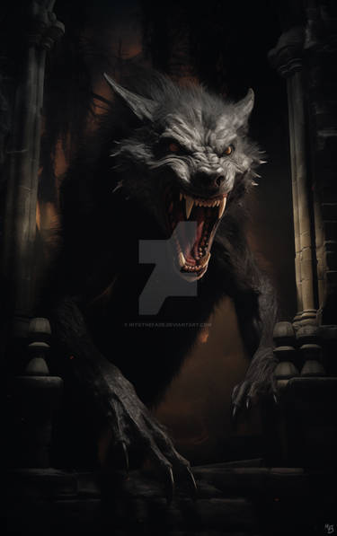
Just colored for fun
Original lines Joe Querio
Original lines Joe Querio
Image size
900x1355px 1.02 MB
© 2012 - 2024 SpicerColor
Comments44
Join the community to add your comment. Already a deviant? Log In
First of all I love the colors and the fact that you sticked to a color mood and didn't use many colors like a lot of colorist do<img src="e.deviantart.net/emoticons/s/s…" width="15" height="15" alt="
The only thing I would say here is I think that if you lighten or color tone the the inks in the background a bit (the ones on the right side of the wolfs face and especially the ones behind his butt) you would create more distance between the wolf and the background and make the creature stand out even more.
I know it's a small thing since the overall effect is already great<img src="e.deviantart.net/emoticons/s/s…" width="15" height="15" alt="